
Create an Image Gallery in Tableau
One irritation with Tableau is the lack of support for BLOB (Binary Large Object) data types, particularly when the BLOBs in question are images. This is a bit of a miss for a visualization tool, since a picture is often worth a thousand words, and makes life rather tricky when your data is a set of images. Without direct support we are forced into using workarounds to achieve the results we want. The beauty of Tableau is of course, that there are always workarounds to get what you want!
This article will describe one fairly simple approach to creating a gallery of images in Tableau that can be comfortably clicked through, and some of the tips and tricks to make this work. So why did we want to do this? Well, to answer that we have to go back in time, to when the raw ingredients of datastrudel first met…
Everyone loves a backstory…but if not just skip ahead to the technical bit 🙂
Nadine had worked for a few years in the German headquarters of Thomas Cook, then Europe’s second largest tour operator. After trying out various roles she finally unleashed her inner geek, joining the Customer & Market Insight team as a Data Analyst and cutting loose on Tableau and Alteryx. With the happy arrival of her two baby girls, Nadine took maternity leave, and a little while later Daniel joined the team.
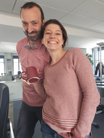
In the team WhatsApp group Nadine began to see troubling images of the newcomer, clearly taking the “wear their flip-flops” part of Thomas Cook’s “Customer at our Heart” strategy a bit too seriously:

By then all Nadine knew was that there was this new Scottish geek in the team, obviously a bit crazy with an “interesting” clothing style.
Meanwhile, back in the office rumours swirled that Nadine would be returning from maternity leave. Daniel didn’t know much about her, except that her Tableau and Alteryx skills were legendary. Finally the glorious day arrived when she appeared back in the office…and Daniel could hand over all of his tedious manual tasks to her, just to ease her gently back into things. She eventually forgave him 🙂
Very quickly it became great fun to work together and we could teach other a lot (useful things like tips and tricks in Tableau and Alteryx, and less useful things like the fact that there is an 8.8 metre long tapeworm on display in the Meguro Parasitological Museum in Tokyo). Before long a telepathic connection was forming, leading to eerie coincidences with pink stripes:
Sadly the fun could not last forever. On 23rd September 2019 it was announced that the Thomas Cook Group plc in the UK had gone into liquidation. At the end of November the German subsidiary company, where we were employed, suffered the same fate. The weeks following the 23rd of September were a tough experience and an indescribable time for the thousands of people who worked for Thomas Cook. Like most of the other colleagues we loved our jobs. We had a fantastic and highly-motivated international team and it was very sad to leave. But true to the saying, “When one door closes, another door opens”, we both quickly found new positions where we could continue using our Tableau and Alteryx skills. And of course we decided to keep working together in our spare time…datastrudel was born!
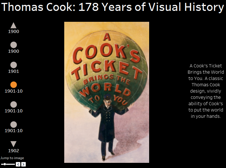
One thing we always loved at Thomas Cook was to look at the vintage advertising posters that lined the corridors in the Oberursel office, and to see how the styles had changed over the 178 year history of the company. So before leaving for the final time, we trawled through the various company websites, trying to find digital versions of this amazing history of travel advertising. Armed with 88 images, we were ready to create a dashboard for them as a tribute to the great times we shared at Thomas Cook.
The technical bit (if you recovered from the emotional backstory)
So, once you have your set of images ready how can you create a nice dashboard to show them off? One fairly simple approach is as follows. Before we begin though, bear in mind that Tableau will not give you much control over how your images actually render in a dashboard. For your best chance of consistent results try to develop a set of similar images, i.e. similar orientations, resolutions, file formats, etc.
Step 1
Organisation is your friend here. Put all the images into a dedicated folder with a sensible name. Move this folder into your Tableau Desktop Repository, below the Shapes folder. This ensures the images will be available as a Shapes Palette within Tableau.
Step 2
Next we recommend defining a unique identifier for each image. The simplest way is to define an index number for each image and save this in the data source of your choice. We used an Excel file in this case. A naming convention for your images is also helpful. We wanted to look at the images chronologically, starting in 1841 and going all the way through to 2019. For that reason the images were named starting with the year that they were from. Sometimes the exact year wasn’t known, or the image was used for many years, so we also used approximations, e.g. 1880s. This meant that our index numbers matched the filename order, and hence also the order in which Tableau shows the images in the Shape Palette. This will be very useful later on.
Step 3
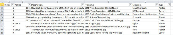
In our Excel file we added some extra information for each image that we thought might be useful. Each row of data contains a unique index number, the period the image was from, a description of the image, the filename, the location of the image and the type of image. In fact the last 3 columns were not used in the end.
Step 4
In Tableau Desktop connect to your data source. We’ll start by bringing in our images. In a new worksheet double-click on your index field, containing the unique identifiers. It should then appear in the Rows shelf. Change the mark type to Shape in the Marks card dropdown. Drag Index onto the Shape card so that your unique identifier will define the shapes used. Click on Shape, then on More Shapes. Open the Select Shape Palette dropdown and locate the sub-folder where you stored your images. In case your sub-folder isn’t yet visible, click on Reload Shapes. Now comes the neat part. Assuming you matched your unique identifier to the image filenames correctly, you can simply click on Assign Palette and each unique identifier will be matched to the desired image. The order of images in the Shape Palette reflects the filename order, so make sure everything is correctly sorted before doing this.
Step 5
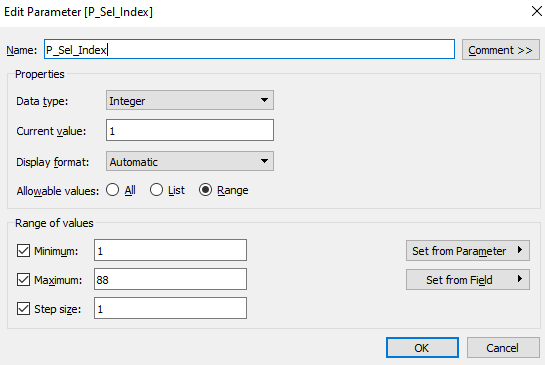
Your viz will now look a little wild, with tiny versions of all of your images displayed in rows. We want to ensure that only one image at a time is displayed. This is easily accomplished with a parameter and some filtering. Create a new parameter (ours is called P_Sel_Index) and make sure it has exactly the same range of values as in your unique identifier (for us this was 1 to 88, to match our 88 images).
Now create a new calculated field which simply checks whether your unique identifier matches the current parameter value. With our dataset the logic is simply: [Index]=[P_Sel_Index]. This Boolean calculation can then be dragged to the Filters shelf and we set the condition to True. Now we should only see a single image on our worksheet! Adding a parameter control to the worksheet will let you happily scroll through your images. At this point you might want to maximise the image size (select Entire View from the dropdown in the centre of the toolbar at the top of the screen), and hide the identifier, the legend and any other formatting (e.g. row divider lines).
Step 6
The next step can be a little fiddly, and the effort required will depend on the images you have collected. We need to ensure that the images will all be displayed fully within our worksheet (and ultimately on a dashboard). By playing with the Size slider and carefully reviewing each image we can make sure that they all display fully on screen, and are not clipped at the edges. If you have a mix of landscape and portrait images, or variable aspect ratios, this could take a little while. An efficient approach would be to scan through thumbnails of your images, looking for “extremes” within your set of images. If the widest and tallest images fit, then the rest should also be ok.
Step 7
For a basic image viewer you could of course stop here. But we want the users to also see the year(s) that the images relate to, as well as some descriptions of what the images show. Create a new worksheet to serve as an image selector. Again, we can just double-click on Index to add this to the Rows shelf. Change the Marks type to Shape and choose filled circles. We now have all 88 index numbers displayed as filled circles vertically on the screen (if you prefer, you can put the circles horizontally on the Columns shelf).
Displaying 88 circles at once is no good, so we create a new parameter (P_Num_Symbols) that will define the number of circles visible at a time:
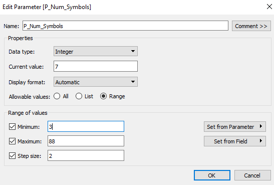
Note that we set a minimum of 3 and use a Step size of 2 here. That means we will only allow odd numbers of circles, i.e. 3, 5, 7, etc. We’ll explain why later.
Next we create a very similar parameter (P_Sel_Index) that will hold the Index value currently selected by the user:
Now create a new calculation as follows:
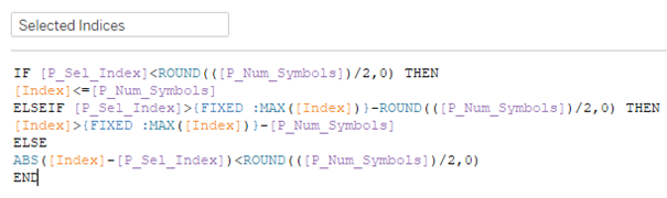
The logic here looks a little tricky at first glance, but it’s not so bad really. Let’s work through it backwards.
The final ELSE clause captures most of the use cases we will have, with users clicking through the symbols somewhere in the middle of the set of images. All we want to do in this case is check that the index number of the image is + or – half of the P_Num_Symbols parameter we created a moment ago. Usually the circle for the currently selected index number will be in the centre of our sheet, with an even number of circles either side of it. This is why the Step size is set to 2 for this parameter.
The ELSEIF clause is checking for the special case that we are almost at the end of the set of images. A quick LOD calculation gives us our maximum Index value (88 in our case). If we are in this special zone, close to the end, then we simply show the final P_Num_Symbols circles.
Similarly the start of the IF statement deals with the special case in which we are near the very beginning of the set of images. Then we simply want to show the first P_Num_Symbols circles.
Note that all three of these conditions return Booleans. We drag this field onto our filter shelf and filter for True. This should now reliably restrict the display of circles to whatever value you have selected for P_Num_Symbols (7 worked well for us).
Step 8
Now we will add a couple of “nice-to-haves”. Firstly, we wanted to see the year(s) of the image, so we simply add a label to our circles using the Period field in our dataset.
Next up it would be neat if we could change the top and bottom circles to up and down triangles respectively, to indicate that further images are available off-screen. For this we need some slightly fiddly logic. There are probably more elegant solutions to this problem, but the following did the trick for us:
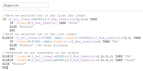
Hopefully the embedded comments (lines starting with //) give a guide to how this works, but again we can easily understand this if we work backwards. Before we begin, let’s re-state the aim here: we need some logic to identify the top and bottom circles, and those in between. We will use the results to define three shapes:
- “Up” (the top circle, which we’ll then change to an up triangle)
- “Middle” (for all the circles in between)
- “Down” (the bottom circle, which we’ll then change to a down triangle)
Similarly, there are three cases that our logic has to handle:
- Edge Case 1: we are very close to the beginning of the set of images. In this case index 1 is the topmost shape visible on-screen, and it should be a circle (since there is no image 0, -1, -2, etc. to discover). We will still need a down triangle as the last visible shape.
- Edge Case 2: we are near the very end of the images. The last on-screen shape represents the very last index number, and so should be shown with a circle (as there are no images beyond it). The topmost shape should be an up triangle, indicating there are earlier images to discover.
- Normal Case: we are somewhere in the middle of the set of images. The top and bottom shapes should be up and down triangles respectively, the rest should be circles.
The logic is built in exactly this order and hopefully it’s now a bit clearer. The only tricky bits are the use of a level of detail calculation to get our global maximum image number (we could have hard-coded this as 88, but flexibility is more fun!) and the use of some rounding to identify the top and bottom shapes.
Finally it would be neat to have the currently selected shape coloured differently to the rest. This is nice and easy: re-use the calculated field from Step 5 (with [Index]=[P_Sel_Index]) and add it to the Colour shelf.
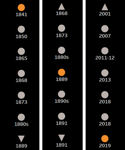
With any luck you should have something like the following, with the three images covering the three use cases described earlier:
Step 9
Now we have 2 worksheets we are ready to create a dashboard. Choose whichever layout works best for your particular images and drag both sheets into your dashboard. We are going to use a simple parameter action to drive the image selection. Set up a new parameter action as follows:
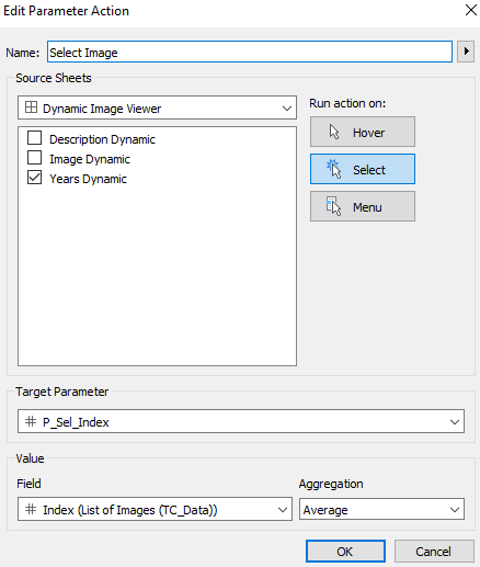
This will simply update the parameter P_Sel_Index to match whichever shape (i.e. index number) is clicked on. Since the parameter is controlling which image is displayed it will also update the image. Easy! The only downside here is that the mark you click on will stay selected, and consequently all the other marks will fade into the background. If this bothers you, either manually de-select the mark or use the parameter slider instead (another benefit of the slider is that you can jump more quickly to widely separated images). Alternatively, you could implement the fairly simple workaround described here: https://www.tessellationtech.io/automatically-deselect-marks/.
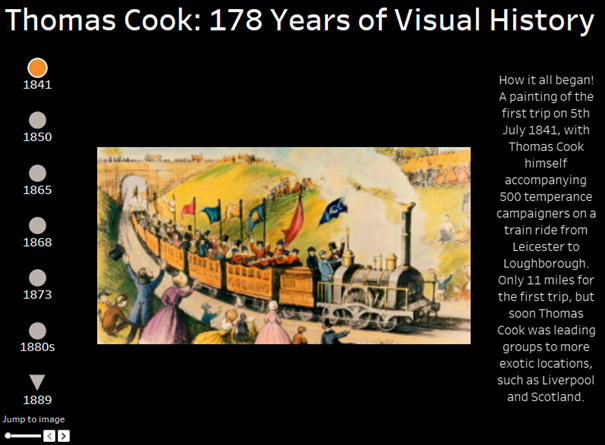
Finally, if you have additional information related to each image then you can use a similar approach to show the info for the selected image. In our case we have added a description for each image. The final result looks like this:
The full dashboard can be seen on Tableau Public. Feel free to download it and adapt it for your needs.
Drawbacks/Limitations:
- As mentioned at the start, there is no easy way to scale the images individually, so this works best if the images are all roughly the same size. Mixing landscape and portrait orientations is not too problematic, as long as you leave room on your dashboard for both possibilities.
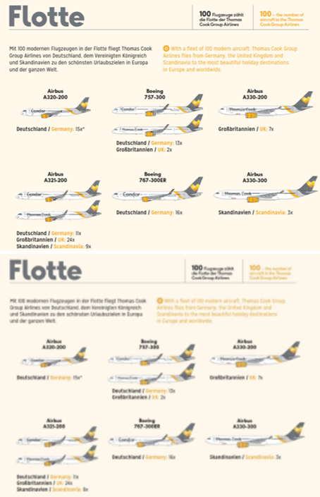
- Occasionally the images display a little blurry in Tableau for unknown reasons. It doesn’t seem to relate to the original resolution or size of the images…if anyone can explain this we’d love to hear from you! A good (or rather bad) example of this in our case is the 3rd last image, showing the Thomas Cook aircraft fleet as of 2018. Pin sharp in the original file, but very blurred in Tableau…
1 thought on “Create an Image Gallery in Tableau”