

Customer Feedback | Net Promoter Score (NPS) Analysis
Did you know that increasing your customer retention rate by as little as 5 percent can increase your profits anywhere from 25 to 95 percent? (source: Bain & Co.) And a statistic by Lee Resource Inc. tells us that it costs five times as much to attract a new customer, than keeping an existing one. So don´t you think one of the the top aims of any business should be to retain their customers and build loyal relationships?
If you want to have loyal customers you need to understand what causes customers to return or to leave your business. You can use customer satisfaction surveys to ask your customers for their opinion about your business.
At my last job at Thomas Cook our Customer & Market Insights team was, among other things, responsible for the Customer Satisfaction survey data. Our survey contained numerous different kind of questions leading to different kind of KPIs shown in our Customer Satisfaction dashboards.
In this article I will concentrate on one part of the Customer Satisfaction Analysis: the Net Promoter Score (NPS).
What is the NPS?
The Net Promoter Score is a simple and useful methodology for tracking customer satisfaction. The metric is based on the customers answer to the question: “How likely is it that you would recommend us to a friend?” The customers can answer on a 11-point rating scale from 0 (not at all likely) to 10 (very likely). Depending on the score rated the customer falls into one of the categories: Detractors (answers 0-6), Neutrals (answers 7-8) or Promoters (9-10).

Detractors are unhappy customers who could spread negative word-of-mouth and work against your business.
Passives are satisfied, but neutral. They lack enthusiasm and loyalty and are vulnerable to competitive offerings.
Promoters are happy and loyal customers who will go around and recommend your business.
And the formula for the NPS score is:
( (Share of Promoters) – (Share of Detractors) ) x 100

The NPS is expressed as an absolute number lying between -100 and +100. (It is not a percentage value)
For instance, if you have 40% Promoters, 45% Passives (or Neutrals) and 15% Detractors, the NPS will be +25. A positive NPS (>0) is generally considered as good.
Advantages of NPS
- Easy surveying – short and simple question which leads to higher participation rates
- Easy to calculate, explain and understand
- Focus on single KPI that needs to be monitored
Disadvantages of NPS
- Lack of information:
1.) we don´t know the driving factors behind customers’ responses to the question. To identify your business issues there is a need to dive deeper into customers’ opinion.
2.) we don´t know the distribution of the answer scores. Also the range from 0 to 6 for Detractors is very wide and it does make a big difference if someone rates 0 or 6. - In case you are using the NPS question for several markets, the NPS value does not take cultural differences into account. Some countries tend to rate higher and it is more likely to get a 9 or 10 whereas some other countries the best rate you can get is 8.
Now I will give you an example of how you could build a NPS analysis dashboard. You can download this workbook and use it for your survey data: https://public.tableau.com/profile/datarock#!/
NPS Dashboard
Linked to my last job at Thomas Cook I chose to build a tourism related dashboard. In my dataset I created a fictitious german hotelchain called “denada hotel” and generated a dataset containing Survey Data for hotel customers.
Among other fields the dataset includes a Respondent ID, a date of arrival (check-in date at hotel), hotel name and location, region of hotel (to address regional manager of Hotels within dashboard), metric names (the metric used in this dashboard is NPS) and metric value (for NPS: 0-10).
The following image shows a dashboard you could use to start with: An overview to get the big picture of your current situation. The dashboard is built to work interactive. To get a nice and clean picture I reduced the number of labels and instead worked with tooltips and Viz in tooltips.
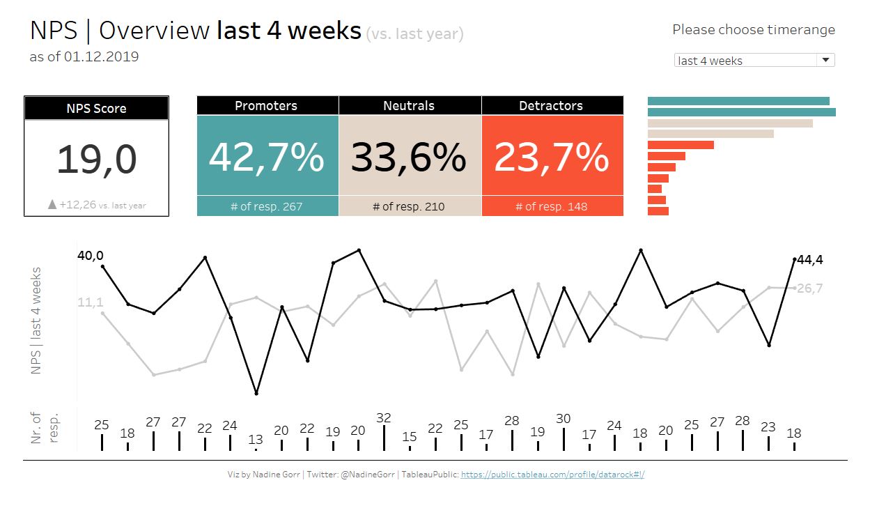
On the top right you can choose the time range you would like to see. In my dashboard you can choose between last 4 weeks, last 12 weeks or year-to-date. Depending on your audience you can change the parameters shown in the dropdown menu or you could let the user select its own custom period.
In this example you can see I have chosen the last 4 weeks and it shows the last 4 weeks compared to exactly the same days previous year (this year in black, previous year in light grey). The NPS score, the share of Promoters, Neutrals and Detractors are shown as BANs to make those figures very clear and present. Additional information in NPS BAN box is the difference to same period last year. The other boxes show the number of responses per customer grouping.
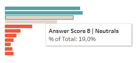
The barchart on the right shows the distribution of the answer scores. This extra information weakens the lack of knowledge when you are only showing your NPS score. The tooltip shows further information.
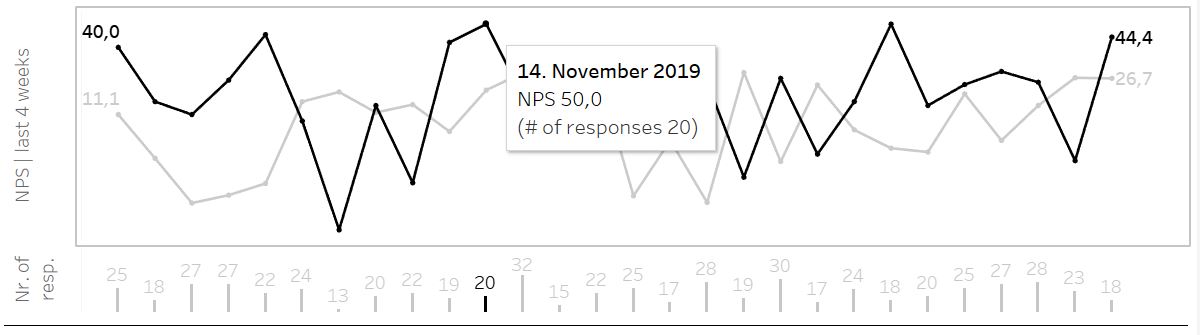
The linechart serves to see your customer satisfaction over time within the chosen period. The black line shows period in current year, the grey line previous year. The barchart below the lines makes the connection between NPS score and number of responses. It puts your NPS score into context and gives the user a feeling for its weighting.
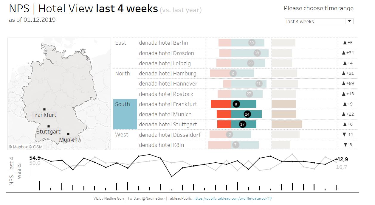
The second dashboard goes further into detail. It gives you, depending on your role or responsibilities, a regional view or a view on hotel level.
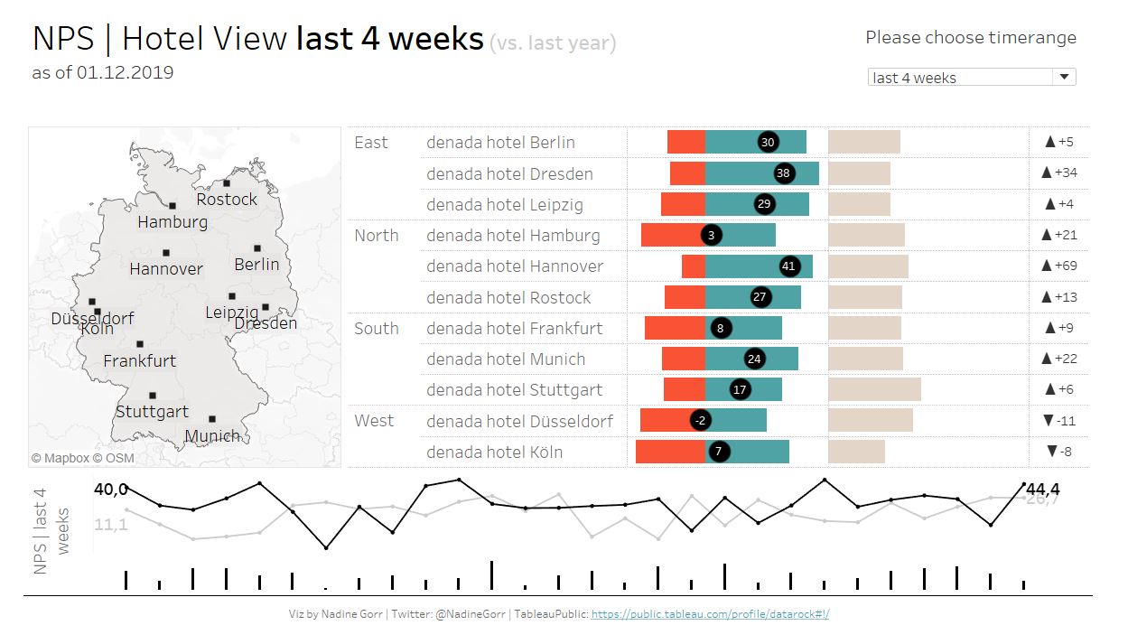
The underlying layout is very similar to the Overview dashboard to avoid confusions. Again you can choose between three different timeranges on the top right.
The map shows all the locations of the hotels within my dataset. The chart next to it contains a list of those regions and hotels. Hovering over the locations on the map or the list will highlight regions and hotels on the charts on the right. Clicking on locations will filter the linechart on the bottom as well as the bars on the very bottom to the hotel or region clicked on.
Region and Hotel are hierarchical dimensions. You can hover over Region and click on the Minus [-] that appears. This is how you can swap between a regional or a hotel view.
For the chart on right hand side I got inspired by Steve Wexler who recently wrote a new article on how to present Likert data. His basic idea was to put the Neutrals off to one side and show Promoters and Detractors on a dual axis chart. All three values are placed along a baseline which makes it easier to read and compare. Often you can see a stacked bar chart to show the share of all three groups (as in Figure 7). This approach makes it hard to compare the size of each group, especially for comparing the Neutrals who are placed in the middle of the stacked bars.
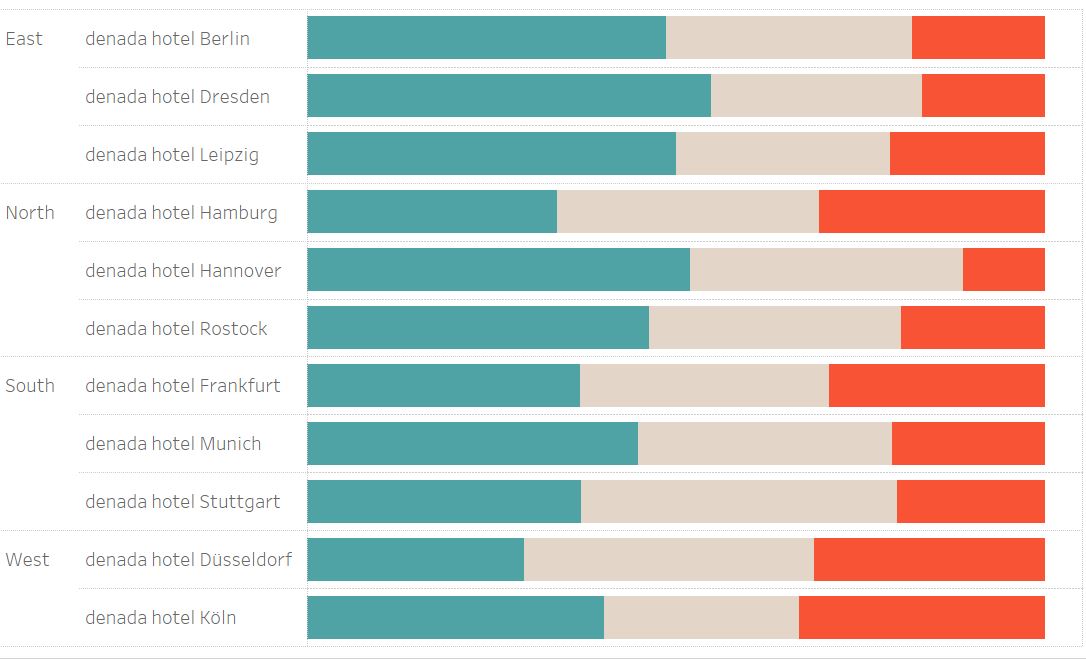
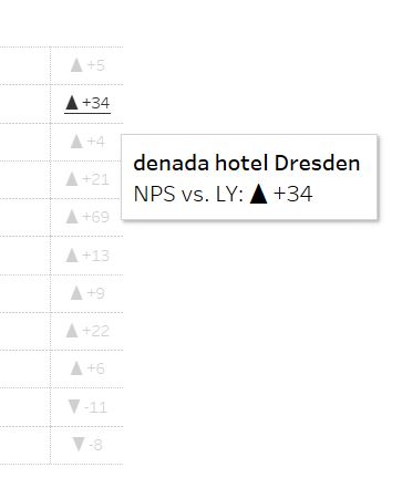
The black circle on the dual axis Chart contains the NPS score. Hovering over the barcharts gives you further information on the exact distribution of NPS answer values by showing a Viz in tooltip (see Figure 8).
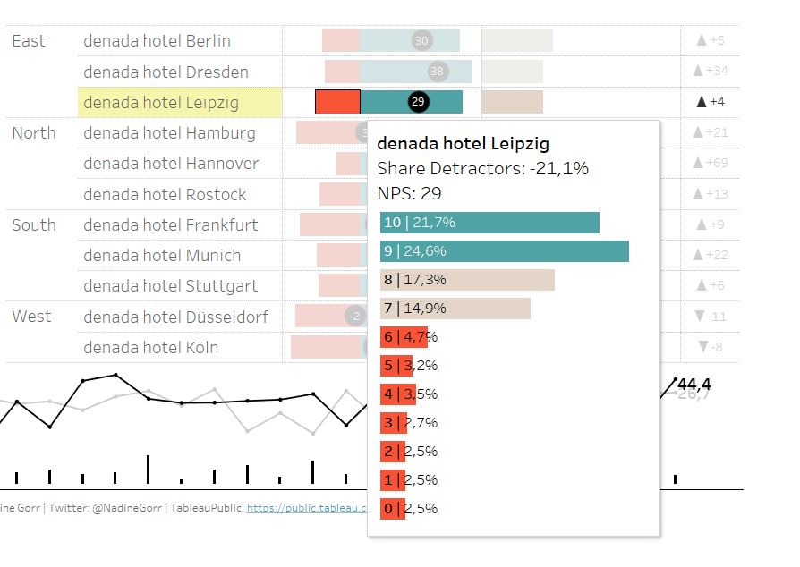
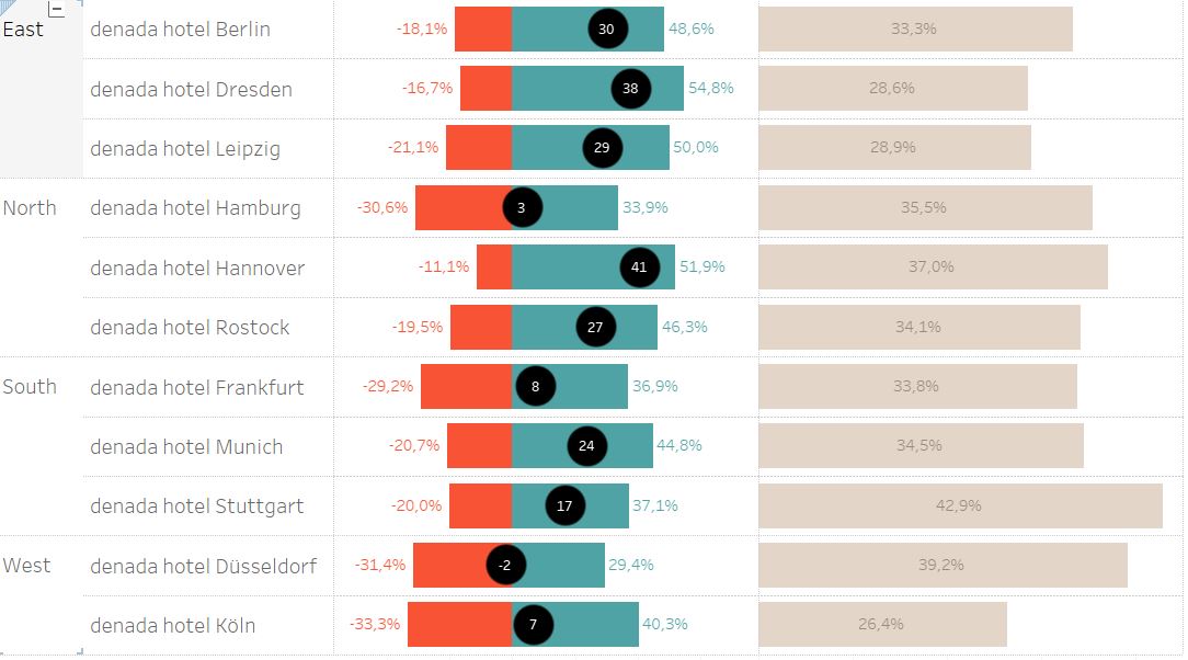
The barchart showing the Neutrals needs a little further trick I also learned from Steve Wexlers blog post. If you would create the barchart and leave it as it is, the sizes of the Neutral bars are not aligned with the bars of Promoters and Detractors (see next image). For instance the Neutral bar showing 33% for Berlin looks larger as 48% Promoters.
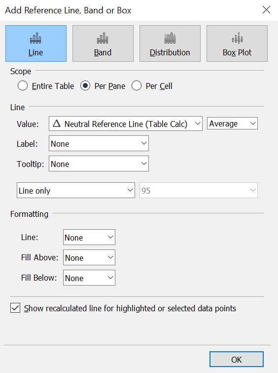
This is due to the automatic axis range Tableau creates. You could set a fixed range but either you will waste lots of space when making the rangesize too big or you might need further adjustments when numbers change. The trick is to create an invisible reference line on the Neutral x-asis. The reference line needs to be at absolute Minimum Value of Detractors Share + Maximum Value of Promoters Share.
It needs three formulas to get your reference line:
- “Window Min Detractors”: WINDOW_MIN([Share Detractors])
- “Window Max Promoters”: WINDOW_MAX([Share Promoters])
- “Neutral Reference Line (Table Calc)”: [Window Max Promoters] + ABS([Window Min Detractors])
Place the reference line on the x-axis of your Neutrals and voilà there we have our adjusted axis range as shown in Figure 6.
On the far right you can see the difference for NPS compared to same period last year. The triangle indicates a positive or negative growth.
As mentioned before, by clicking on one of the hotels the NPS line chart on the bottom as well as the barchart showing number of responses will get updated to chosen region or hotel. For example the following dashboard is filtered to Region South. So the NPS linechart and the number of respondants barchart are aggregated to the hotels in Frankfurt, Stuttgart and Munich.
Let me summarize: The NPS is a great starting point, with all the strengths and weaknesses of a simple business metric. It gives you a feeling of how well the customers perceives your business and by monitoring your NPS value over time you can see if a value goes up or down. If you really want to understand your customer and define actions to improve your retention rate you will need to ask more question. There will be more blog articles coming soon highlighting further topics like Satisfaction figures and free text comments.
If you have any more ideas on how to present NPS data or you want to comment my article please feel free to contact me.
Again, here is the link to the workbook on Tableau Public: https://public.tableau.com/profile/datarock#!/
Thanks for reading this article!
Nadine Gorr