

Show Your Stripes
Ed Hawkins’ warming stripes have become a common sight over the last couple of years. You can see examples for many countries at https://showyourstripes.info/.

Of course, selecting countries from a dropdown is not the most user friendly way of showing off this data. Fortunately recreating them in Tableau is nice and easy.
Firstly we are going to need some data. Head over to http://berkeleyearth.org/data/ where you can find a variety of temperature datasets. We grabbed a global land and ocean dataset, as well as data for the northern and southern hemispheres. Finally we downloaded all of the country-level data.
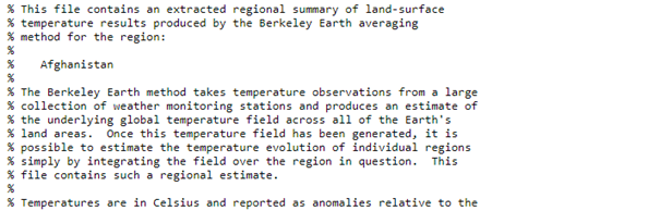
Each file contains a set of comment rows at the beginning which describe the contents…
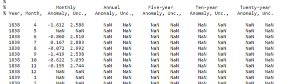
…and then the data that we need…
The first challenge then is to strip out the comments and read in the data that we want to visualize. This time a quick bit of Alteryx* did the job nicely:
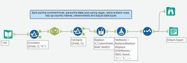
Note the wildcard *.txt at the beginning, that lets us read in all of the files in one go. A neat option here is to also add the filenames as a new column in the dataset – this ensures we know which country each row of data belongs to.
Since the data is not well structured we read each row in as a single big text string. After that it’s a simple matter of filtering out any rows that start with % (the comments), then using RegEx to get the space-separated columns into separate fields. Next we filter out any blank rows and then tidy up the country names that we derive from the filenames. Finally we can rename the fields in the Select tool, make sure the data types are set appropriately and write the cleaned dataset into a hyper extract.
* For those of you without Alteryx, look how quick and easy this is – just a few tools strung together and we can import hundreds of files, manipulate the data how we like and dump it to a single output. Having this logic in a visual workflow, alongside explanatory comments, makes it very easy to remember what you did when you come back to it again after several weeks or months.
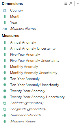
Now for the Tableau part. Connect to the hyper file we just made and you should see something like:
We want to create the warming stripes to be equal heights. To do this it’s quite convenient to stretch your analytic skills to the max with the following calculated field:
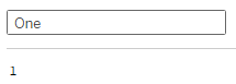
Set the default aggregation to average (if there any duplicate data rows we don’t want to double count them). Incidentally, we add this One calculation to almost every dashboard we make as it’s so useful. It’s near-identical twin Zero (=0 as you’d expect) can also be very handy, though we don’t use it here.
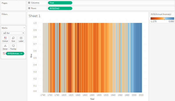
Double-click on the Year field and Tableau should show you each year across the screen. Then drag your One field to the rows shelf. Set the mark type to Bar. Next drag Annual Anomaly to the Colour card. By default Tableau will sum this, but average is probably a better choice, especially if you have many different countries or regions of data in your dataset. Already we have something pretty close to what we want:
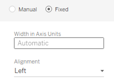
To prevent the bars from overlapping click on Size and then select Fixed:
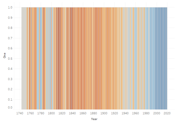
This is one of those neat features in Tableau that appeared at some point without much fanfare, but which is really useful. The chart should now look something like this:
From here on in it’s mostly a case of tidying up the formatting, reversing the colour palette, so that orange represents warmer years and blue cooler years, hiding unwanted visual elements, etc. If you have downloaded data for multiple countries or regions then you will want to think about a nice user interface to make the data easy to play with. Our finished dashboard lets the user select countries from the map and adds some context by comparing them to the global dataset, as well as the northern and southern hemisphere data:
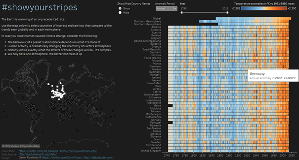
As ever there are a few bells and whistles added, e.g.
- Use a set action on the map to choose which countries are displayed as stripes. With a little logic we also ensure that the global and hemisphere data is always displayed. This helps avoid an ugly blank screen if no countries are selected.
- Parameters to let the user choose which of the timescales to display, and also to control whether the country names are displayed to the left of the stripes. This last option is useful if a lot of countries are selected.
- A Year filter: useful as different countries have very different historical records, and also for examining shorter time periods in more detail.
There is quite a lot to fit on the screen here, so it’s best viewed on a largish laptop or desktop. Here is the finished dashboard:
https://public.tableau.com/profile/daniel.rowlands#!/vizhome/showyourstripes/showyourstripes