
Dynamic Layout and Sorting of a Small Multiple Atlas in Tableau
Recently I stumbled across this artwork by the late Belgian conceptual artist Marcel Broodthaers:

https://www.tate.org.uk/art/artworks/broodthaers-atlas-p07213
Actually this isn’t the artwork itself, but rather a print of silhouetted countries intended for his book The Conquest of Space: Atlas for the Use of Artists and the Military. Each country would be cut out and added as a single page to the tiny atlas, which measured no more than a few centimetres across.
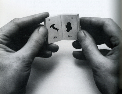
The absence of detail, equalized size of each country and lack of any geographic context deliberately conspire to make the atlas of no real use to its supposed target audiences. That’s my kind of art! You can read more about it here.
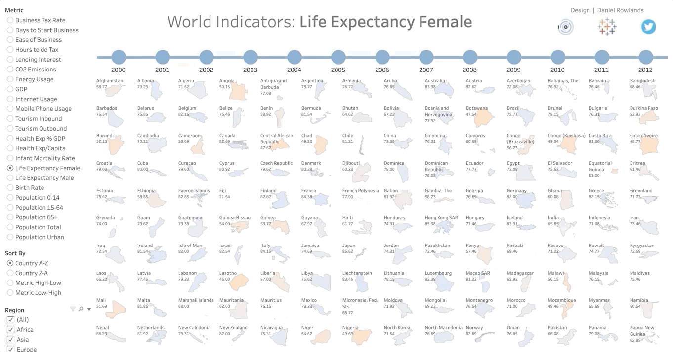
The print with the silhouetted countries reminded me of an idea I’d had a few years ago, to make a dynamic, small multiple atlas in Tableau. To get started I simply took the World Indicators dataset that Tableau ships with. Most countries are present and we have several metrics and time periods to play with – perfect!
As a first step I want to create the heart of the dashboard, i.e. the matrix of countries arranged in a neat grid. To accomplish this a row and column value need to be assigned to each country. Now, there are several possible approaches that could be taken here, but since you and I are so incredibly dynamic we’ll try to avoid hard coding anything. We’ll largely follow Kevin Flerlage’s approach (explained here) but with the added dynamic juiciness of Andy Kriebel’s approach (explained here).
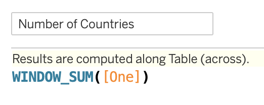
The key to the dynamic approach is keeping a count of the things (in our case countries) shown on the viz at any particular time. As we filter and play with the dataset this count will of course change. To get a dynamic count I chose to use my old friend, the custom calculation “One”, which I have in almost all of my dashboards:

I’m not sure that really deserved a screenshot, but it has been very useful to me over the years so we’ll let it have its moment of glory. Then a window calc will give us what we need:
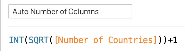
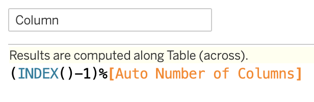
So far so good. We now have to decide what kind of layout our matrix of countries should have. To keep it simple I will aim for a square layout, but depending on your use case you might want to do something different at this point. Perhaps a long, thin matrix would work better, or you might want to fix either the number of columns or rows. But for a square matrix we can simply use the SQRT function to automatically calculate our total number of columns for the currently visible set of countries, then wrap an INT around it to round down to the closest integer value, and finally add 1 to get as square a matrix as possible:
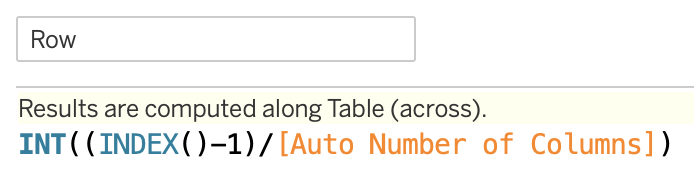
Next up we need the individual column and row numbers for each country. Here the ever-useful INDEX function is indispensable:
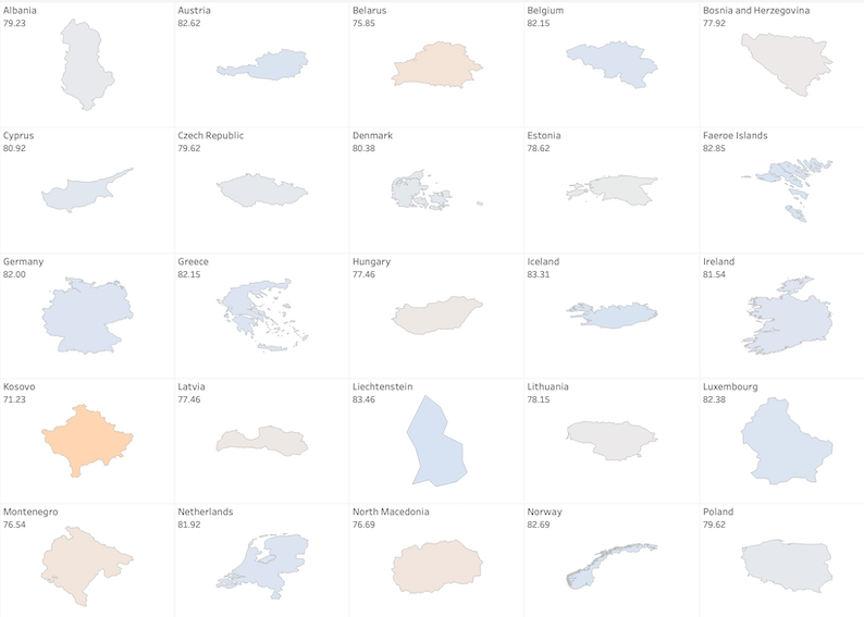
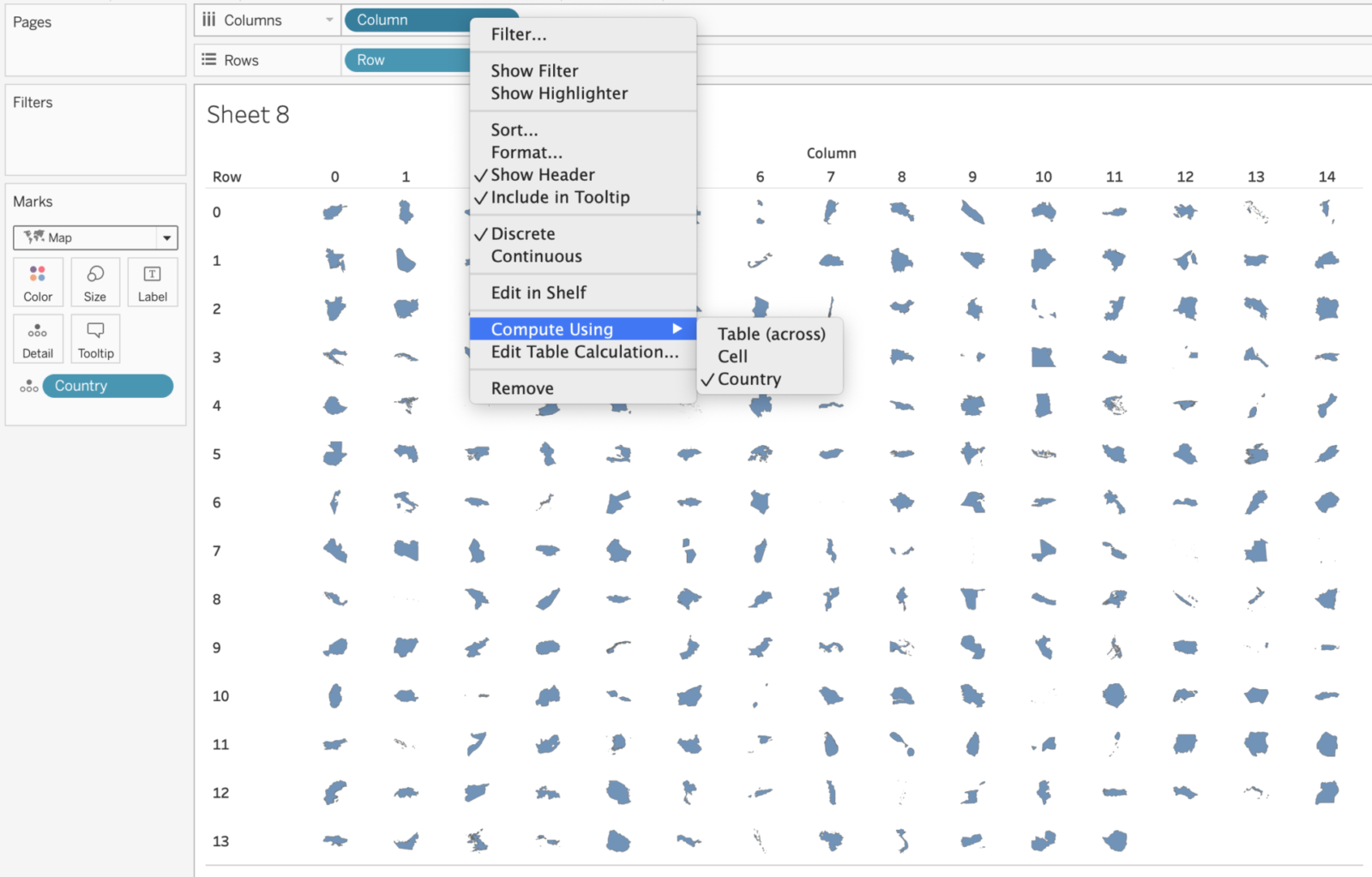
We already have enough to create our first matrix of countries. Simply drag Country to the Details shelf, Column to the Columns shelf and Row to the Rows shelf. Then right click on the Column pill and set Compute Using to Country. Repeat for Row. Remember to set the viz type to Map and remove the generated Long/Lat pills if they are automatically added. Hopefully you should see something like this:
If we only want to display the countries then we are pretty much done. We are already approaching a result that Marcel Broodthaers might have appreciated. But since we have various metrics to play with let’s add some additional features. For example, it would be neat if we could choose which metric to display. And having control over the sort order of the countries would also be great.
Dynamic Metric Selection
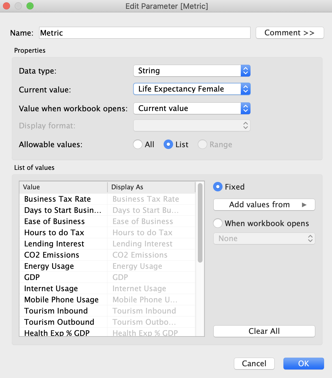
Let’s take these in turn. First up, the easy bit. Let’s create a parameter to allow selection of the metric:
After a lot of typing in parameter names we’ll need a corresponding calculation to then deal with our selection:
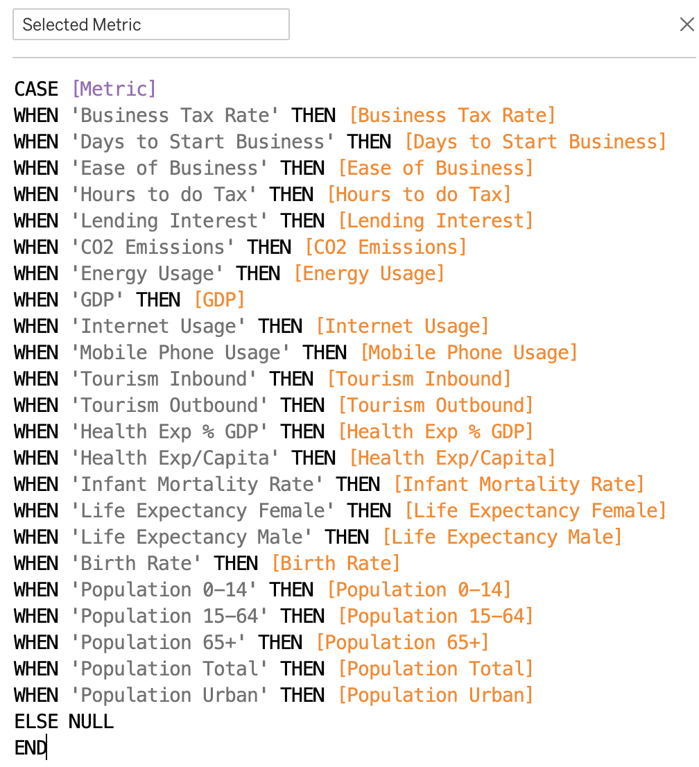
This now lets us easily swap between different metrics. Nothing too tricky so far.
Dynamic Sorting of Text and Numeric Values
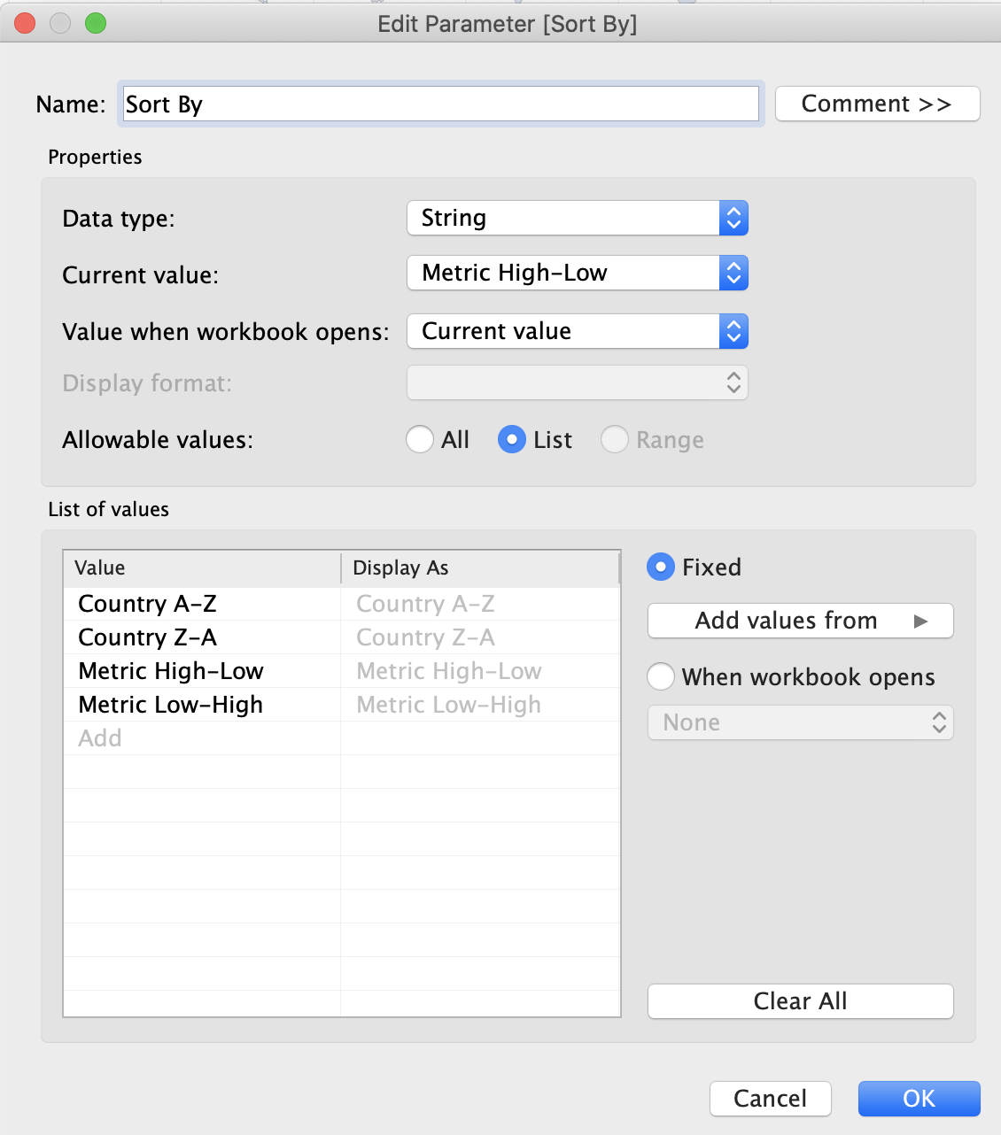
Next up we want to gain control of the sort order of the countries in our matrix. Just to make things interesting I thought it would be fun to offer the user four sort choices via a parameter:
Next we just need a quick calculated field to take the parameter selection and point to the relevant fields, right? Well, not quite. Eagle-eyed readers might spot a slight challenge in my idea. We are mixing data types – somehow we are going to have to get Tableau to sort both text (Country) and numeric (Metric) values! Unfortunately that’s not really possible out of the box, since our calculated field that we will sort on needs to have a single, consistent data type, i.e. it can’t change from text to number depending on the parameter selection. We need to either convert the numeric values to text, or the text values to numbers.
Intuitively it might seem easier to simply convert the numbers to text, but in our case we have wildly different metrics, each with differing orders of magnitude and numbers of decimal places. Converting these to text quickly gets very messy, e.g. ‘100,000,000’ will appear before ‘2’ if we sort in ascending order, as the first character ‘1’ is less than ‘2’. Trying to catch all possibilities for the many different metrics here proved to be a bad plan (I tried for an hour or two!). But if you have clean and consistent numeric values in your dataset, and especially if the number of digits is consistent, then you might find this approach easier.
With the World Indicators dataset it is much easier to convert text to numbers. There isn’t really an elegant way to do this conversion, so we are stuck with a couple of brute force methods.
First up, we could assign a couple of numbers to each country, representing the required sort order, i.e. Afghanistan is given number 1 (for ascending sort) and 207 (for descending sort). That’s a bit ugly though and is very hard coded. We’d have a lot of re-work if the list of countries changed, as it does from time to time. Also, we don’t always have full control of our data sources, so a more dynamic approach would be better.
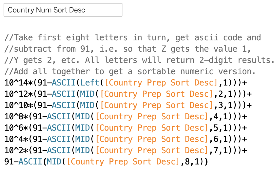
The key to a dynamic approach is to remember that letters also have ASCII codes, which conveniently are assigned in alphabetical order. The letter “A” for example is ASCII code 65, “B” is 66, and so on, up to “Z” at 90 (the lower case letters range from 97 to 122, but cunningly we won’t be using them – see below). So we should be able to assign a numeric value to each letter in the Country names and use that for our sorting.
Before we start it pays to do some preparation of the Country names as follows:
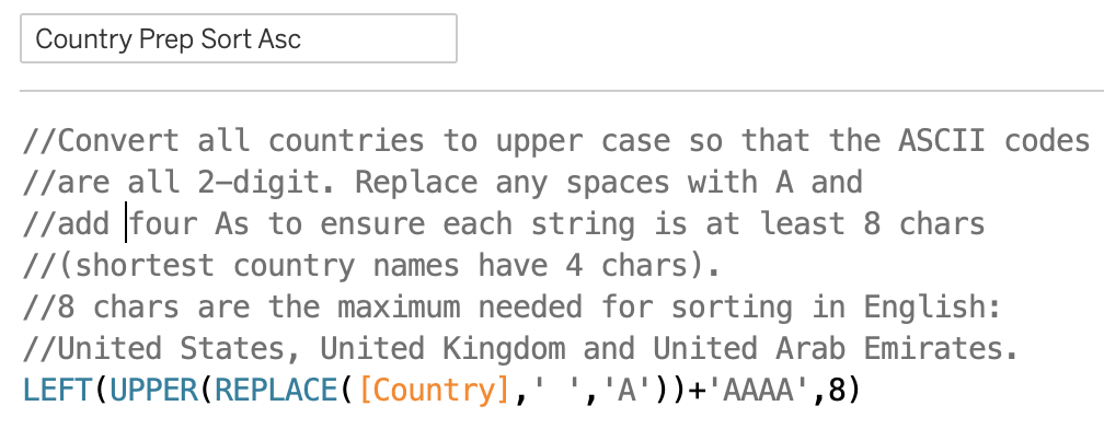
Here we have simply imposed some consistency on our country names, ensuring they are all upper case (giving us 2-digit ASCII codes), that any spaces are replaced with “A” and that they are at least 8 characters long (so Laos becomes LAOSAAAA, Mali becomes MALIAAAA, etc.). Adding As in this way will ensure any spaces, or padding are sorted first (for the descending sort we create another calculated field but add Zs instead). Note that we don’t have too many special characters in country names, at least none that affect the sort order, but if you are trying to sort other text data this might become important.
Luckily 8 characters are all we need to sort country names in English. Why is this lucky? Well, because our sort calculation looks like this:
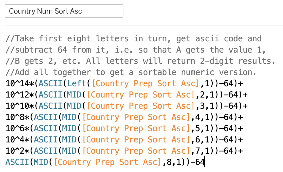
Nice huh? The important thing here is that our letters A-Z will return values of 1-26 (that’s why we subtract 64 everywhere), i.e. a maximum in the tens. For that reason we need to multiply each letter by a power bigger than tens, i.e. by hundreds, then ten thousands, then millions, and so on, to ensure that successive letters can’t “leak” into their predecessors numeric value.
An example might help to understand this. Imagine we had two 2 countries, Abcd and Abbz. The numeric values we would get for these letters would be 1, 2, 3 and 4, and 1, 2, 2 and 26 respectively. Simply adding these together would give us sums of 10 and 31, since the value of z swamps the previous letters, and Abcd would be sorted erroneously before Abbz. But by multiplying each letter by successively higher powers, stepping up by two powers each time, we ensure that the letter values are mathematically separated. In this case we would have: 1*1 000 000 + 2*10 000 + 3*100 + 4 = 1 020 304; and 1*1 000 000 + 2*10 000 + 2*100 + 26 = 1 020 226, i.e. Abbz would correctly be sorted before Abcd.
For 8 letters we end up multiplying our first letter by 10 to the power 14! That’s getting pretty close to the limits of precision that most regular software stores numbers with, so I’m glad we only needed 8 letters! Bear this in mind if you ever use this approach for other types of text. If you need more than 8 letters to do reliable sorting, then you might want to reconsider!
The calculation for sorting the Country names in descending order is pretty similar:
So, we finally have our text in a numeric form, suitable for sorting. Now we can combine it with the metric values:
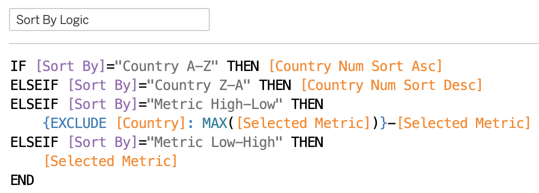
This is the field we will use for sorting. As mentioned above, we have to fix a sort order for this field and I arbitrarily chose an ascending sort. The only trick remaining here is for the descending sort of the metrics. I use a Level of Detail calculation to get the highest metric value irrespective of Country, then subtract the metric values for each Country from this highest value. In other words the highest value will always return a 0, then successively smaller values will return increasingly positive results. In this way we can trick Tableau into sorting in descending order.
The Dynamic Small Multiple Atlas and Animation Weirdness
So, putting this all together, and adding some other UI bells and whistles leads us to the final dashboard. In Tableau Desktop you can enjoy the wonders of animation:

But sadly Tableau Public doesn’t seem to like animations of maps quite so much…
What’s odd here is the decision making. I can just about accept (i.e. not really) that animating maps might be a bit too computationally intensive on the server, but rendering them statically is clearly not a problem. So why replace animated maps with circles?! Who asked for circles?! Surely Tableau should instead drop the animation in this case, rather than changing the viz type! I’d much rather miss the nice-to-have animation than have the entire viz wrecked by removing the maps!
I’ll be wildly optimistic and hope the Tableau Devs are already planning to resolve this weirdness in 2020.4, but in the meantime I’ve had to upload the non-animated version to Tableau Public 🙁 You can easily download a copy and switch on the animations for the Matrix worksheet though 🙂
Extra Bonus Weirdness
And while I’m dreaming, maybe we can finally get a choice of map projections in Tableau 2020.4. Most countries display ok in the dashboard, but far northern countries get noticeably squished 🙁
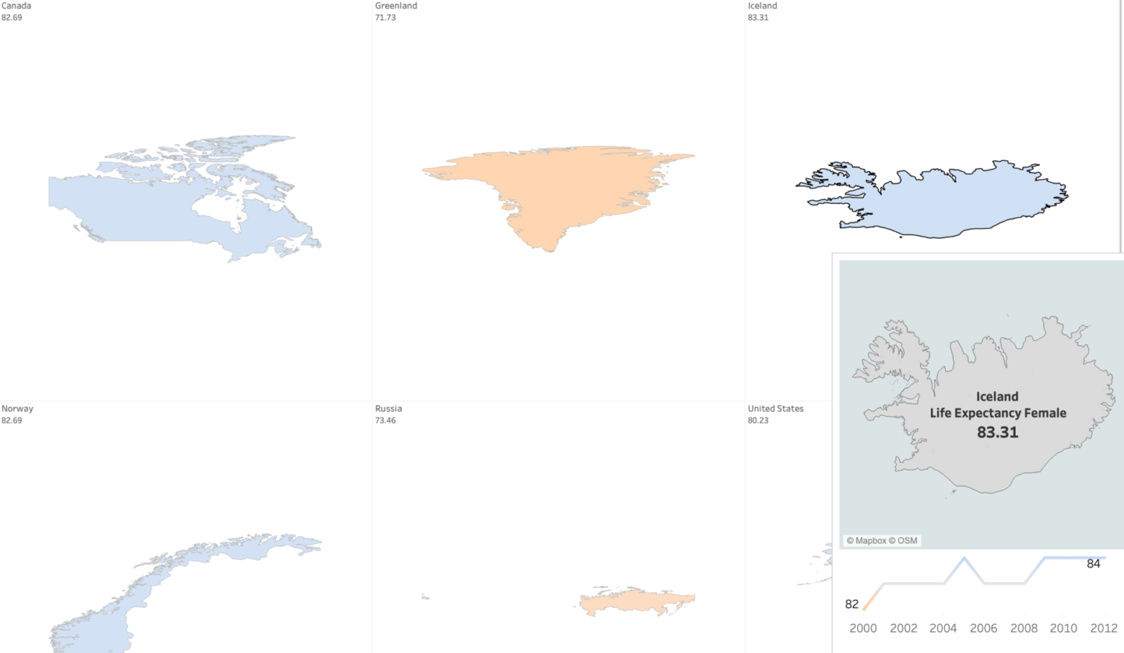
Oddly this doesn’t carry over into the tooltip though. I suspect the equalized scaling of the countries in the matrix is to blame, even if Marcel Broodthaers would have loved it. If any passing Tableau Devs can explain what’s going on here, I’d be interested to know more.
The final weirdness concerns Russia. In the matrix the far eastern part is displayed at the far left, with an ocean of white space separating it from the motherland. But in the tooltip the default view is more conventional:
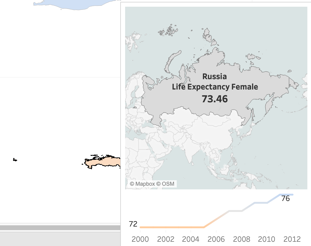
I guess if you’re foolish enough to have your country straddle the eastern and western hemispheres then you get what you deserve. Then again, Tableau seems to have taken the trouble to ensure that America does not show this behaviour, albeit at the price of giving up its claim to the delightful sounding Rat Islands and the ludicrously named Near Islands (near to what?!), which just so happen to lie in the eastern hemisphere:
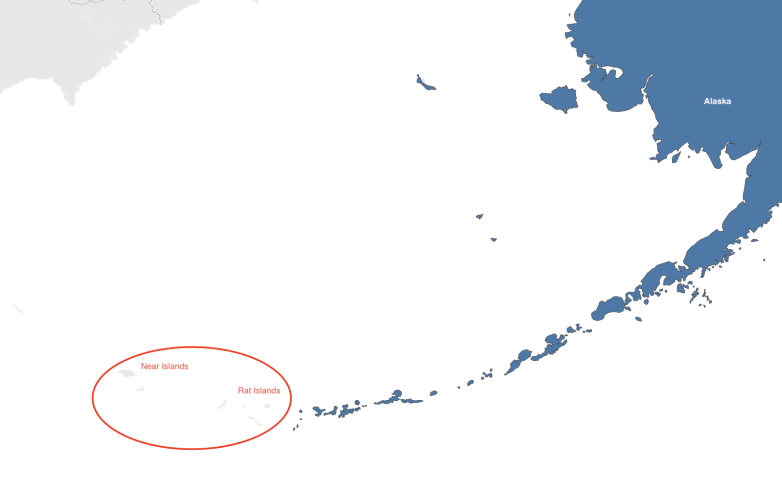
Meh, who needs them anyway? America has more than enough islands.