
Control your Tableau dashboard with toggle buttons
At my work at DB Systel (a subsidiary of Deutsche Bahn) we are a small group of colleagues trying to meet virtually for a Makeover Monday once a week. At the end of our sessions we reflect on the works done by the Twitter-datafam. Last week (week 35, 2020 – topic: “Indian batsmen v left-arm pace”) buttons with a soft UI design (also called Neumorphism) seemed to be the must-have feature for the Makeover Monday community.
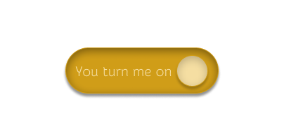
So, I wanted to create one by myself and that’s what came out of it:
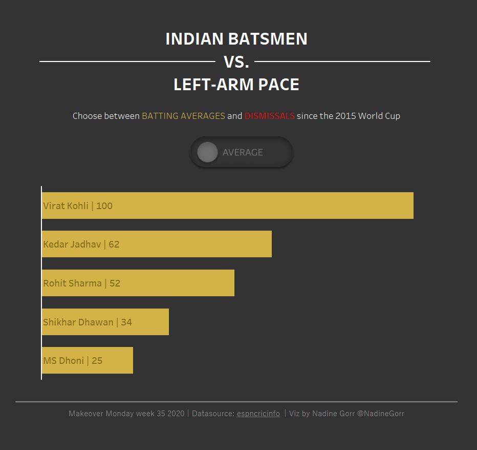
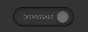
Purpose of my toggle button was to switch between two measures shown in a barchart. In this case one of the measures was called “Average”, the other one “Dismissals”.
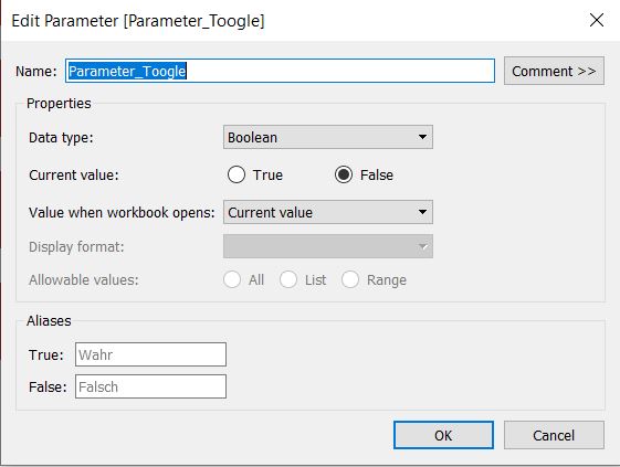
Step 1: Create a boolean Parameter
The button will work by using parameter actions. Therefore you need to define a Boolean parameter which can be true or false.
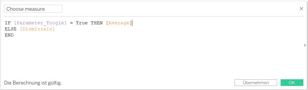
Step 2: Create a calculated field to switch between measures when clicking on button
If the parameter is true the function will return the measure “Average”. In case it is false the output of this function will be “Dismissals”.
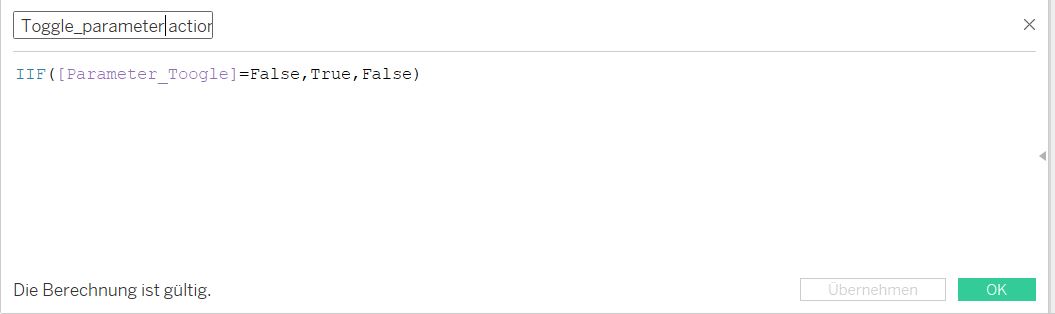
Step 3: Create a boolean field “Toggle_parameter action”
This field will be needed for your parameter action. It tells your parameter what to do by clicking on it: it jumps between true and false. Also it will be the placeholder of your button-shape, which can have two characteristics: switch left and switch right.
Step 4: Create two images of your toggle button
As mentioned in the previous step you will need two images of your button: one with the circle on the left hand side, one with the circle on the right hand side.
I used Figma to create my toggle buttons. In case you haven´t worked with Figma before: I can highly recommend this tool to help you create dashboards, icons, buttons etc.
To create my buttons I used this tutorial:
https://uxplanet.org/create-a-toggle-switch-in-figma-light-mode-vs-dark-mode-178dfb1017b9
And this was the result:
Step 5: Drop the two images in a new folder in your shapes repository
Look at this tutorial in case you don´t know how to create custom shapes.
Step 6: Create your viz
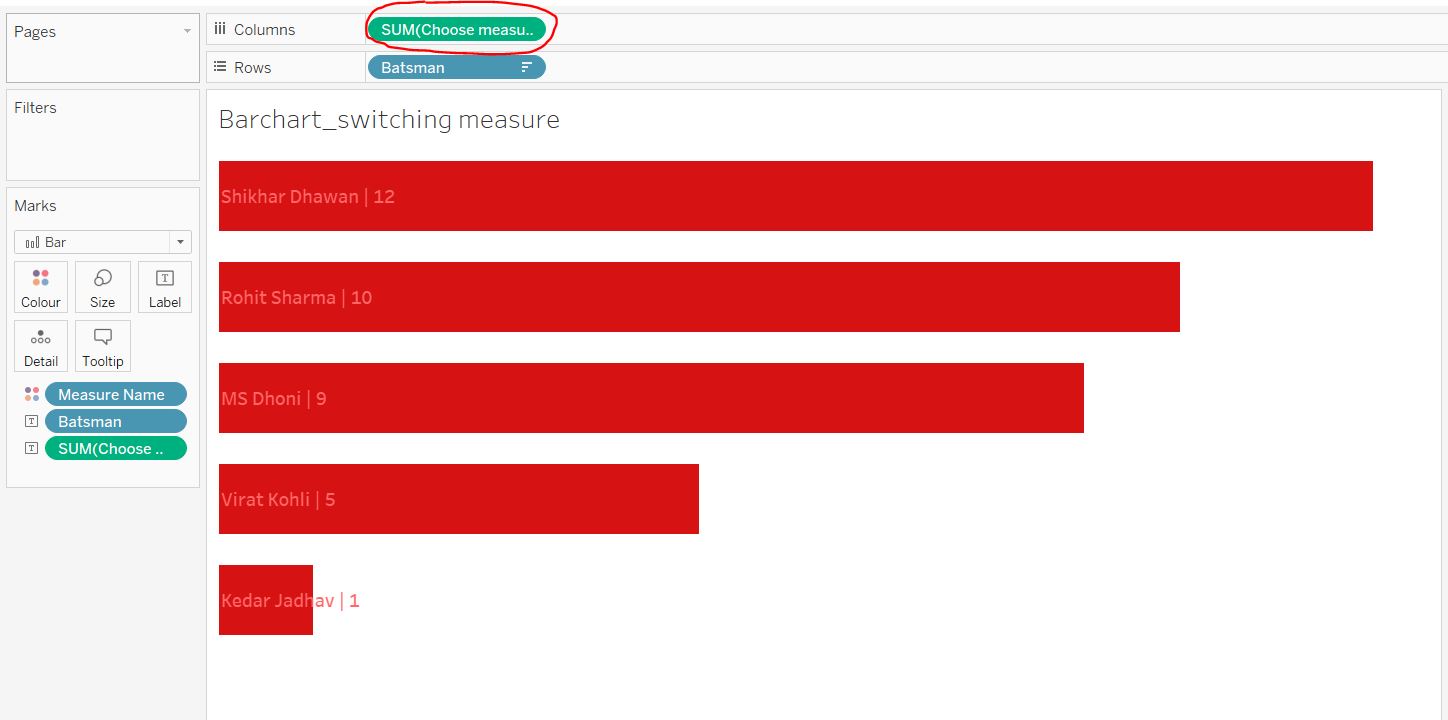
Create a new sheet for your barchart (or whatever chart you would like to show). The measure needs to be your calculated field “Choose measure”.
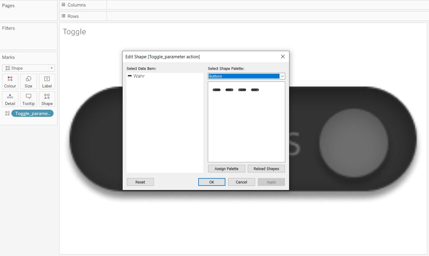
Step 7: Create another sheet to show your toogle button
I used a separate sheet with shapes as buttons. Change the dropdown menu on the marks card to Shape and just put the calculated field “Toggle_parameter action” on Shape. Now you change your shape by using the button images you created and stored in your shapes reposititory.
Step 8: Get your dashboard ready!
Place both sheets (toggle button and chart) on your dashboard and create a parameter action:
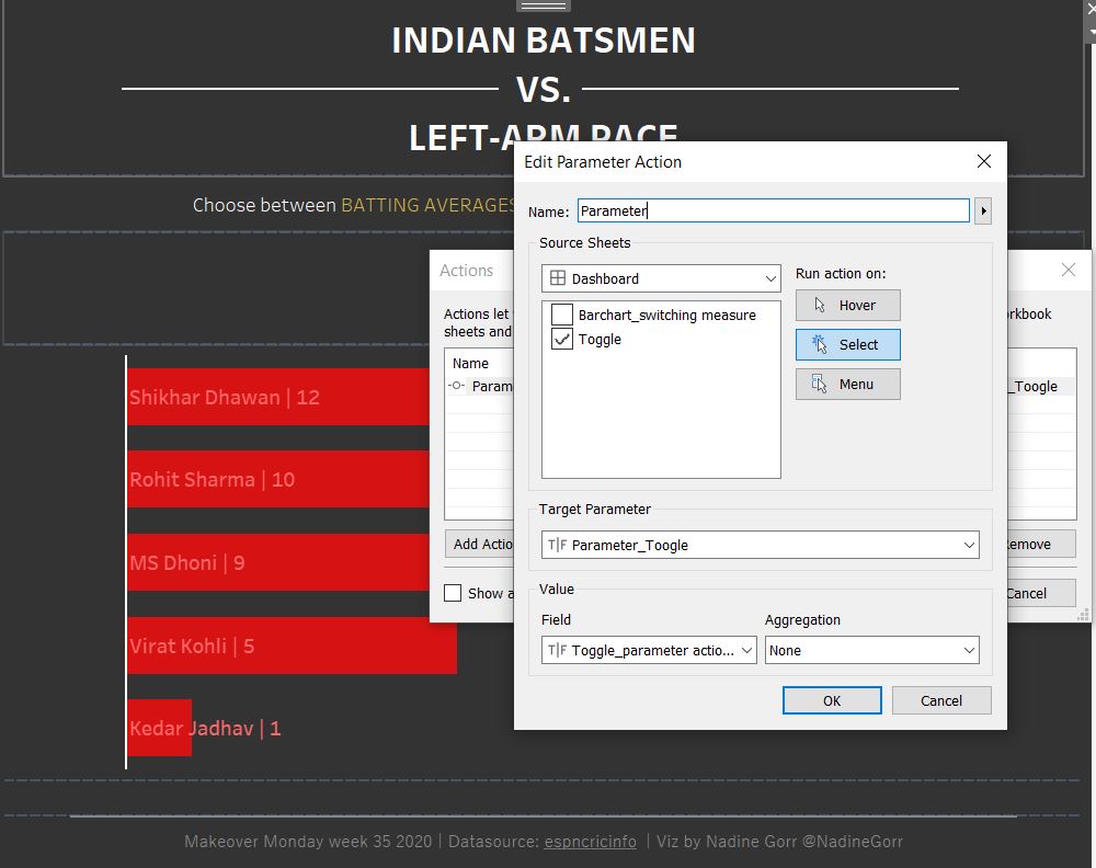
Now you can use your button to switch between both measures.
You can download the interactive viz here:
https://public.tableau.com/profile/datarock#!/vizhome/MakeoverMonday_2020_w35_IndianBatmenvleft-armpace/Dashboard?publish=yes
Here are some related links:
https://www.robertjanezic.com/blog/modern-dashboard-design (Design inspiration for Dashboards with soft UI elements)
https://tessellationtech.io/toggle-button/ (another approach to create a toggle switch)