
Sorting out the UK with map layers and noodles
The map layers feature introduced in Tableau 2020.4 is a great addition. Together with “noodles”, aka data relationships, there is finally a neat and elegant solution to a long-standing problem: how to deal with that messiest of multi-national unions, the UK.
A real world example helps to illustrate the point. Let’s imagine we want to produce a simple map showing all of the countries in UEFA, the governing body of European football. To make it a bit more topical we will also show which countries have qualified for the Euro 2020 tournament (now planned to take place in summer 2021) and add the host cities for good measure. Easy you might think, except we soon run into a challenge.
You see, back when they were inventing football in the 1800s, the constituent countries of the UK decided to compete individually, as England, Scotland, Wales and Ireland. This has remained the case ever since, except that the Ireland team eventually split into the Republic of Ireland and Northern Ireland teams.

What this means in Tableau is that our UEFA dataset will contain data for two distinct Geographic Roles, namely what Tableau likes to call:
- Countries – Spain, Slovakia, France, Norway, Republic of Ireland, etc.
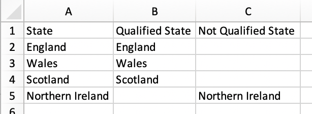
- States/Provinces – England, Scotland, Wales and Northern Ireland
With previous versions of Tableau, managing the data at these two distinct geographic levels could get quite awkward. But in 2020.4 it’s a breeze. Our simple dataset can be spread over three Excel sheets as follows:
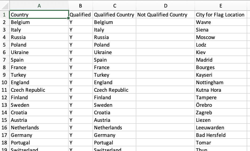
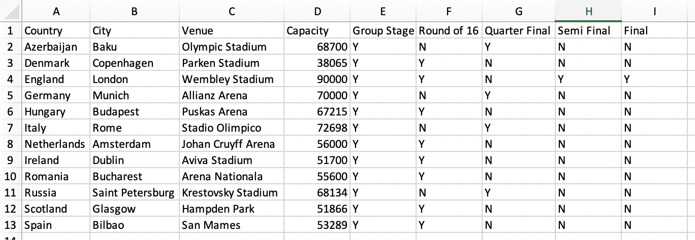
The final data we want is for the host cities:
Now we can connect to our Excel file and let the real fun begin. First up we have to let Tableau know which data we want. We can start by dragging in the Countries sheet. Next we drag in the Host Cities sheet – Tableau helpfully suggests that the two Country fields should define the relationship. Finally we add the States sheet. In this case we need to specify that Country is equal to State:
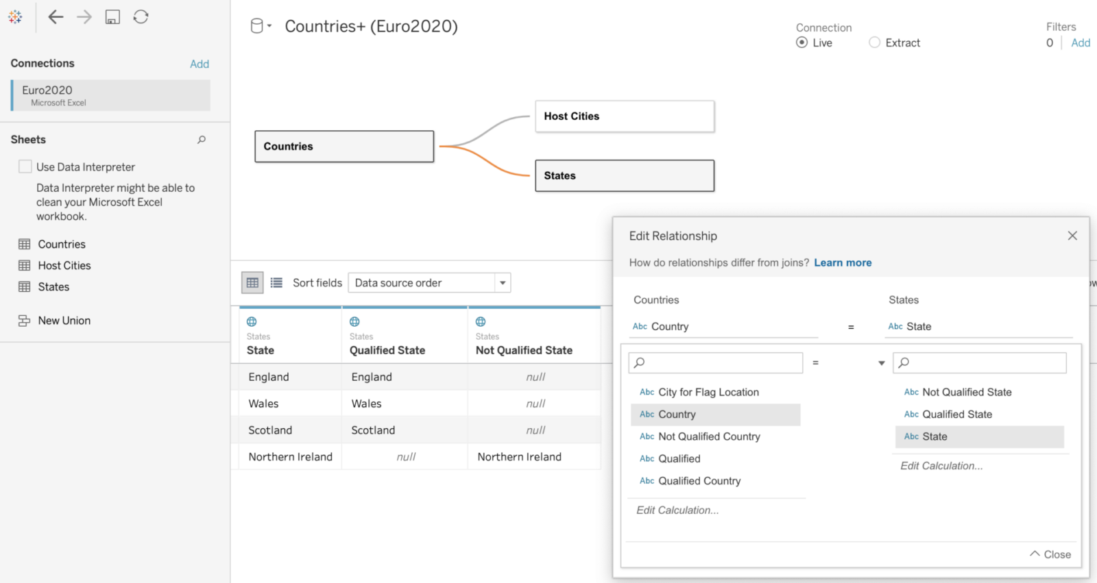
Tableau even shows the effect of this relationship in the preview window. The relationship effectively acts as a filter, limiting our results to just the four UK countries when we use the States data. But note that we are not filtering out the other countries when we look at data from the Countries or Host Cities datasets. This is the magic of the noodle.
With our data sources and relationships defined we can start making our map. On a new sheet we create a chloropleth map using the Country field from the Countries data source. We can use the field Qualified as the colour. You should see something like this:
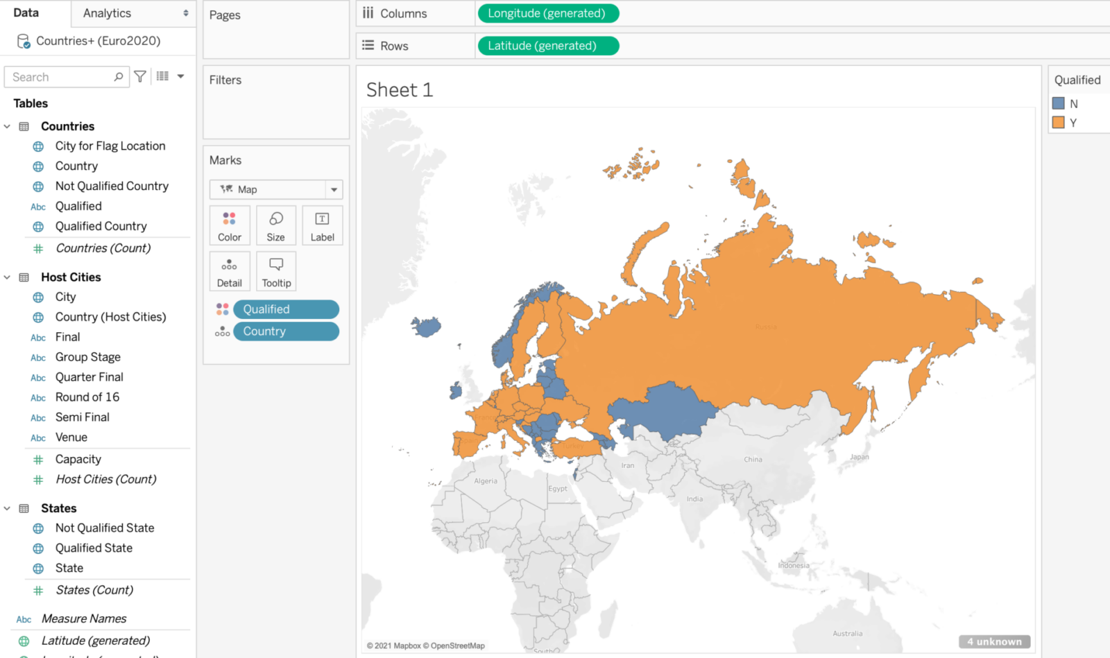
This is a good start, but as the bottom right warning indicates, we have 4 unknown countries to deal with. As you might have guessed, these are of course the 4 UK countries, which Tableau doesn’t recognise within the Geographic Role of Country. For now we will ignore the warning.
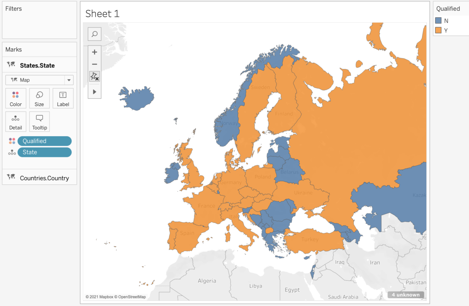
To get the 4 UK countries to appear we need to add a new map layer. We simply drag the State field to the top left corner of the map as shown:
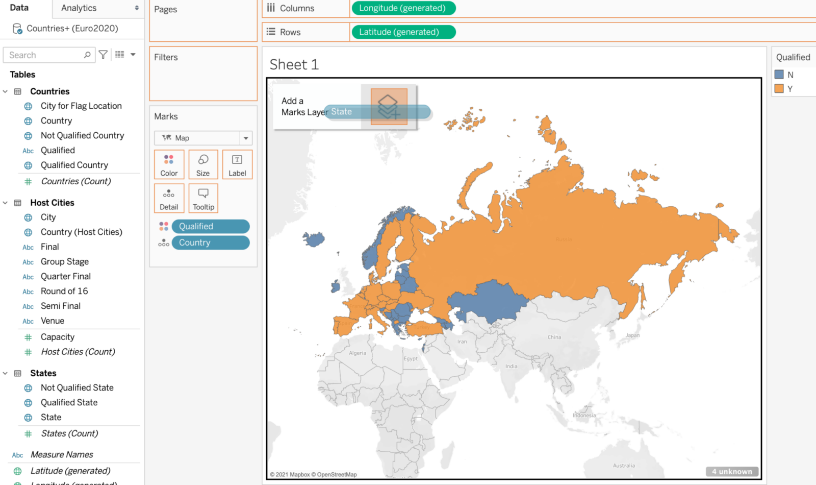
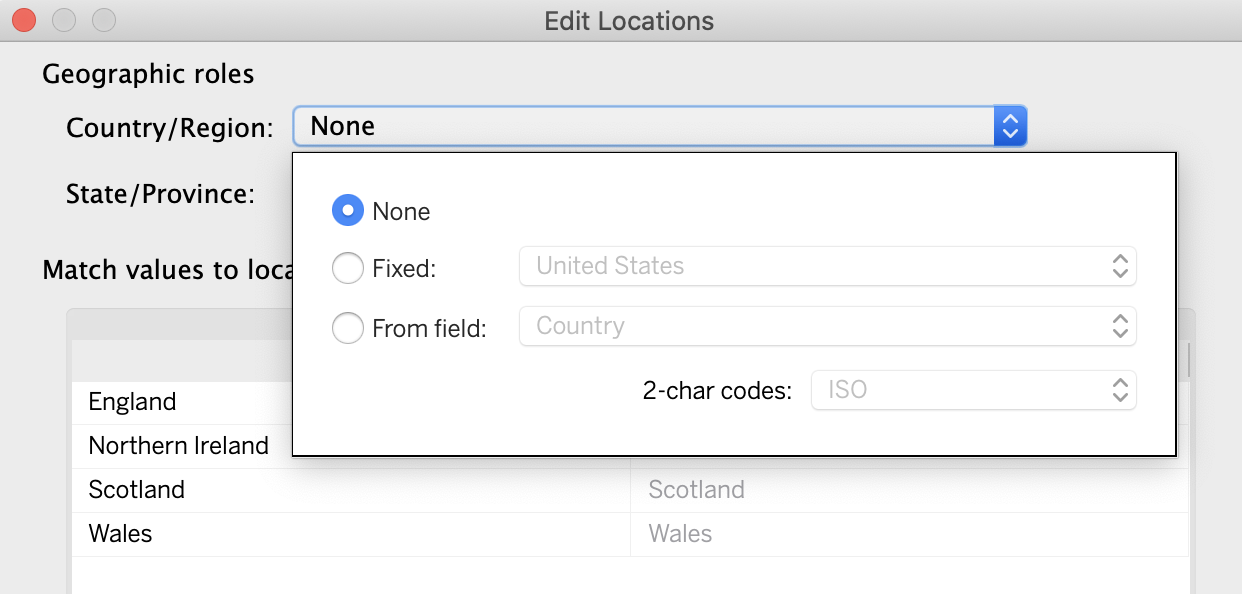
Set State to Detail, change the visualization type to a chloropleth Map and add the field Qualified as the colour. Depending on your settings you might not see the countries yet. If this is the case you may also need to edit the locations as follows (by default Tableau thought my State/Province data was in the US):
The result should now be a single map which shows data for two of Tableau’s Geographic Roles:
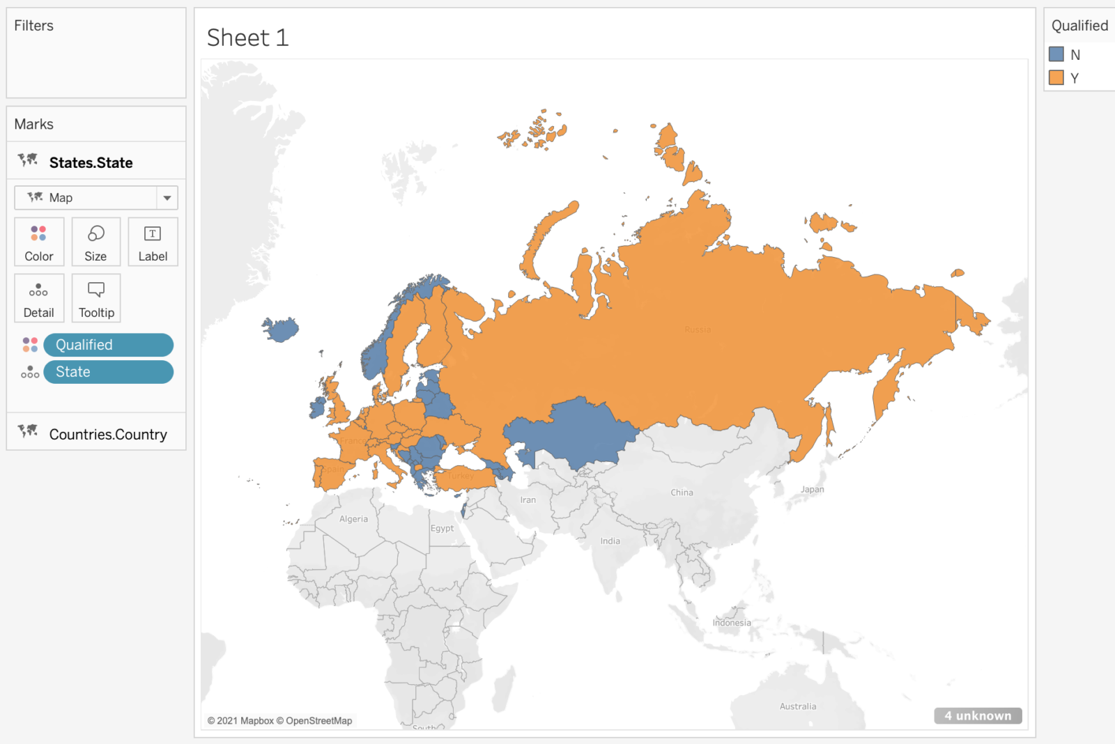
(This seems as good a time as any to once again bemoan the lack of control over Tableau’s default map boundaries. It’s great that Russia is a member of UEFA, just a shame that it’s so big that I can’t see much of the rest of Europe. How nice would it be if I could tell Tableau to instead make the default map boundary something like this?
Russia is still by far the biggest country on display, and if Kazakhstan had qualified for Euro 2020 I’d even consider zooming out a bit, just for them. Here’s hoping customizable default map boundaries will appear in 2021…)
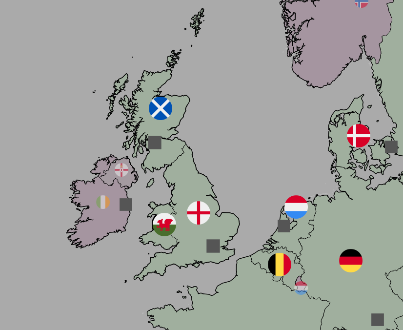
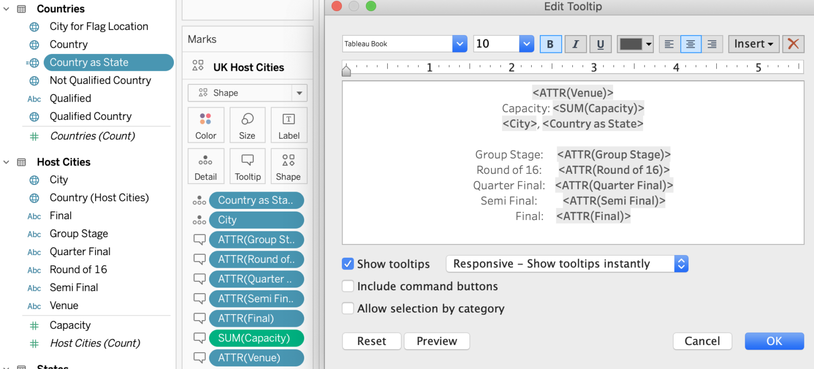
To add the Host cities information we follow a similar process, simply adding the additional map layers as required. Once again we have a UK complication. Glasgow, Scotland and London, England, will host matches. In order to display the correct city/country information in the tooltips for these two cities it is helpful to create a duplicate of the Country field, called Country as State. I then set the Geographic Role of this new field to State/Province and add it to the tooltip:
For each additional map feature we generally need to add two map layers: one for the regular countries, using the Geographic Role of Country, and one to handle the special case of the UK countries, using the Geographic Role of State/Province.
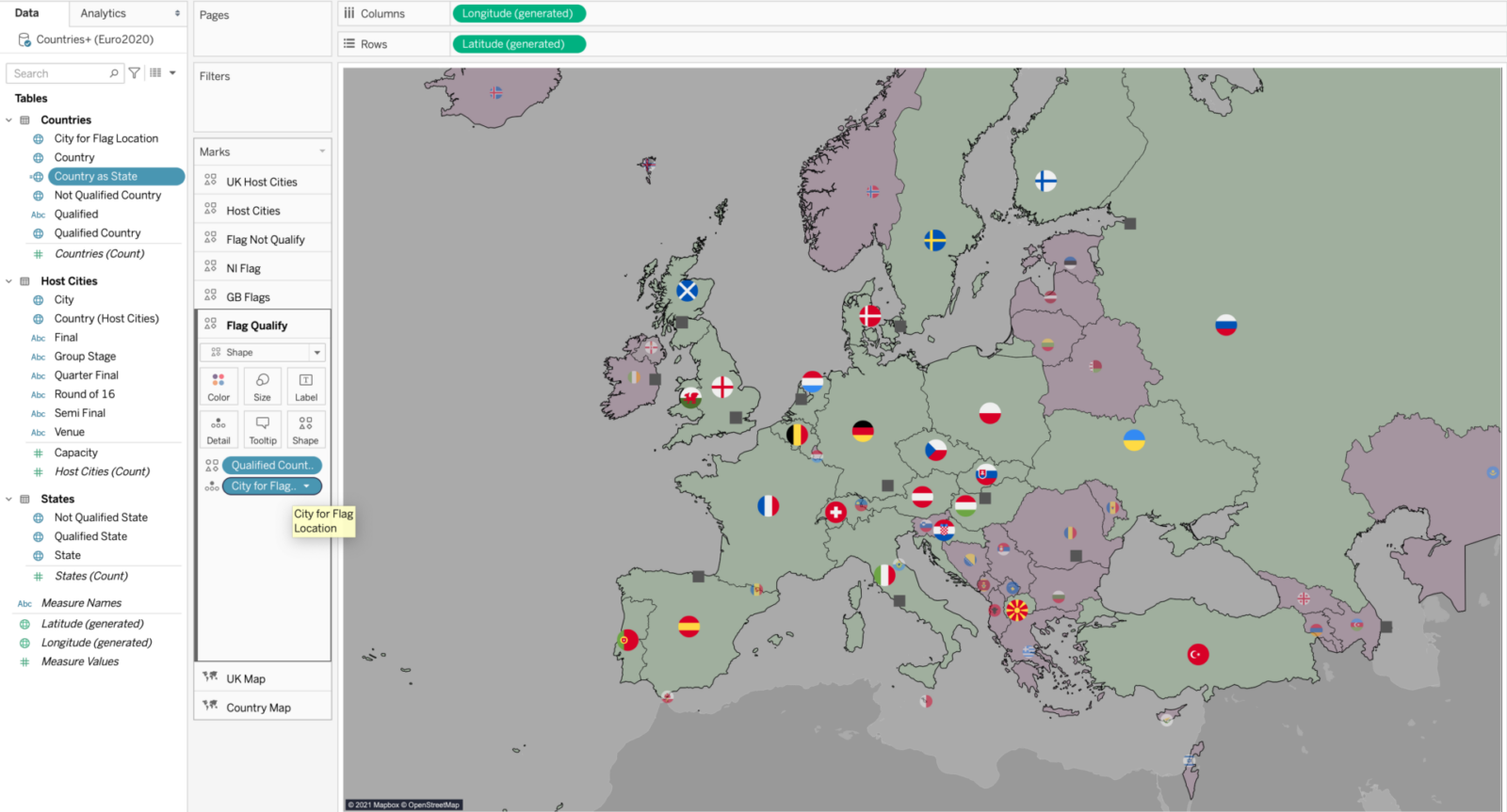
An example of this is adding flag icons for each country. I decided to add large flags for qualified countries, but needed an additional layer to handle Scotland, England and Wales. Similarly I wanted smaller, slightly transparent flags for those countries that didn’t qualify. In this case I needed to add an additional map layer just for Northern Ireland.
The final complication for our map is that we are mixing chloropleths and symbols. The chloropleths require use of the Longitude (generated) and Latitude (generated) fields, and, at least for the time being, we can’t add independent lat/long fields for each map layer. If we plot the flags using the default locations Tableau assigns to each country, then we don’t always get them in the desired positions. In particular the default locations sometimes clash with the Host City locations. In order to gain control over the positioning of the flags I instead added a field to the Countries data called City for Flag Location. For each country I then searched for a city that Tableau recognises that would place the flag in a reasonable location. A brute force solution, but it does the job. The end result is as follows:
Hopefully that is helpful for some of you out there trying to use map layers. They are a great new feature but still have a few quirks that require workarounds. Let’s see how Tableau further develops them over the next few releases!